
Design Tips
Custom CSS for Reviews Widget
In this guide
Understanding CSS and Widget Classes
Style Classes You Can Use
How to Use the Style Contract Table
How to Create Custom CSS for Your Widget
Desktop and Mobile CSS Tips
Mirror App widgets include a broad range of built‑in styling options. However, if you need more control, you can use Custom CSS to fine‑tune the look and make the widget match your website's design perfectly.
Understanding CSS and Widget Classes
CSS (Cascading Style Sheets) is a language that controls how elements look on a page. While HTML defines the structure — text, images, buttons — CSS handles the visual presentation: colors, fonts, spacing, borders, and layout.
CSS works by selecting elements and applying styles to them. You can target elements using their HTML tags, classes, or IDs.
To apply custom CSS to your widget, you first need to know which classes are available. These class names are listed in the Style Contract table on this page. Use only those classes — they are stable and safe for styling.
Style Classes You Can Use
How to Use the Style Contract Table
The table contains all the CSS classes you can use to customize your widget. Each row gives you three pieces of information:
• Component — the part of the widget (e.g., widget, header, content, rating)
• Property — the specific element within that component (e.g., title, image, elements)
• Class — the exact CSS class name — copy this and paste it into your custom CSS

tip
To change the header title color, open the header card, find title under Property, and copy the class next to it
How to Create Custom CSS for Your Widget
1
Open your Mirror App dashboard and select the widget you want to customize
2
Navigate to the CSS tab
3
Copy the class name from the Style Contract table
4
Paste it into the custom CSS field
5
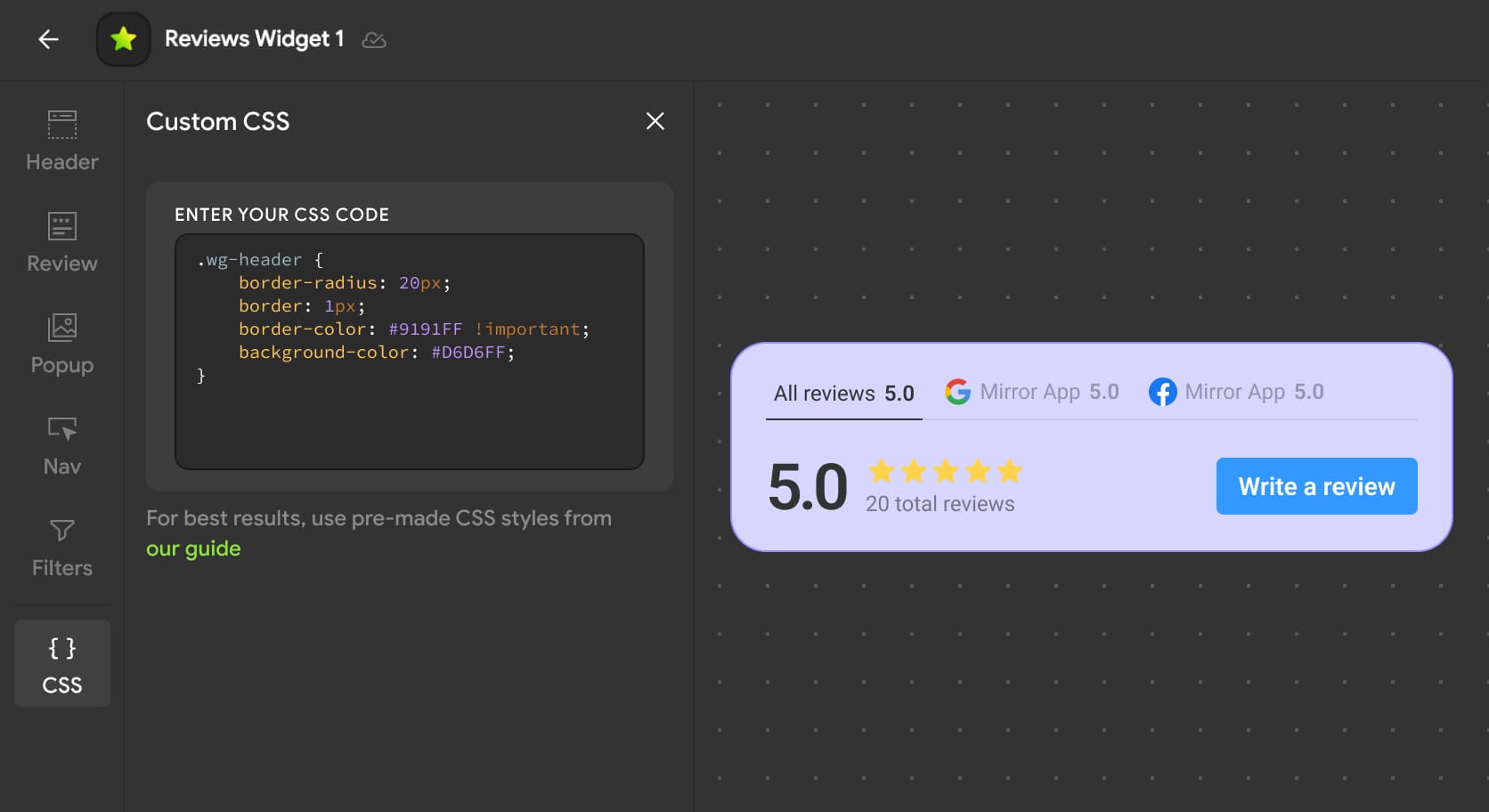
Add your styles inside curly braces
tip
• Always use the exact class name as shown in the table
• To override existing styles, add !important after the property value
.wg-header {
  padding: 20px !important;
  background: #1a1a2e;
}
• Changes apply instantly in the preview
• The element you're customizing will be highlighted as soon as you add or edit a CSS rule
Desktop and Mobile CSS Tips
Use media queries to apply different styles on different screen sizes.
For mobile screens (up to 480px wide):
@media (max-width: 480px) {
  .wg-card {
    padding: 12px;
    font-size: 14px;
  }
}
For desktop screens (481px and above):
@media (min-width: 481px) {
  .wg-card {
    padding: 24px;
    font-size: 16px;
  }
}
You can adjust the breakpoints to match your website's design system.
💡 Additional Tips
✅ Preview live — all CSS changes appear instantly in the editor
✅ Use only classes from the Style Contract table — they are stable and won't break
✅ Test before publishing — use the editor preview to make sure everything looks right
✅ Keep it clean — avoid over‑styling; small changes often work best
Was This Article Helpful?

Do you still have questions? Contact us



Language
Language